
Click the link, play with the demo data. This app is the personal finance app I needed. What would turn it into a must-have for you?
Great app! One thing you could improve is make the front page when you get in more simple. When I got in, I was very confused as it does not have a clear explanation on how to use it, it just goes to a demo. Make it more straightforward and have a clear place where you can connect your bank account.
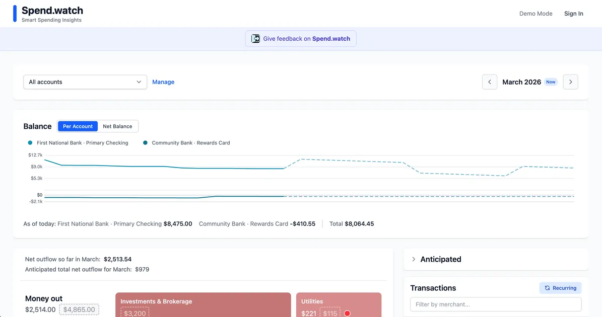
This URL drops visitors STRAIGHT into the dashboard with zero onboarding context — no hero, no "here's why you care," nothing. A new visitor lands and sees a wall of spending tiles and thinks "what am I looking at?!" The DEMO MODE toggle is tiny and buried top-right. That is your ONE shot to hook someone and it is basically hidden! The actual product is GENUINELY compelling — real-time anticipated vs. actual spending per category, with historical typical ranges, is a KILLER insight layer that Mint never had. But visitors can't see that value because there is no narrative framing it. The "Smart Spending Insights" tagline does zero heavy lifting. Tell me WHY I need anticipated spending — am I going to avoid overdrafts? Save more? WHAT IS THE DREAM? BIGGEST problem: this is not a landing page, it is a logged-in app screen masquerading as one. You NEED a proper homepage with a bold problem statement, a 30-second demo video or animated GIF of the best feature, and a prominent "Try Demo" CTA. Build that landing page and your conversion will transform overnight!
The actual-vs-typical spending comparison with those colored category tiles is genuinely useful visual shorthand, and the demo mode letting people poke around without signing up is smart. But here is the thing I keep coming back to: every bank app already shows you categorized spending, and Mint died because even free was not enough to keep people engaged with this type of tool. What is the wedge that makes someone leave their bank dashboard for spend.watch? The tagline "Smart Spending Insights" is doing zero work to answer that question. I would kill to see one concrete claim on the page like "find $200/month you are wasting" instead of a generic dashboard tour. The anticipated inflow and the red/green dots showing over/under typical spending are the closest things to a real differentiator I can see, but they are buried in the demo with no explanation. If those predictions actually work well, lead with that, not the balance chart every bank already gives away. Right now a visitor lands on what looks like a Mint clone in beta and has no reason to create an account. I would focus the entire pitch on the one thing your bank cannot do, and make that the headline.